Oscar Eavis, co-founder and Strategy Director at creative agency Mox, argues that most brand-artist collaborations aren’t collaborations, they’re talent rentals with a sexy co-creation sticker on them, so what’s the secret to a successful partnership?
Collaborations can often go something like this: The brand arrives with the world already built, the script already locked, the visual language already decided. Then the artist gets dropped in like a mannequin with a following.
The brief screams for ‘authenticity’ but the brand makes sure the whole thing is thoroughly sanitised beyond recognition. Most brands pick artists based on follower count, not creative compatibility. That’s model casting, not artist collaboration. The creative world is built around the brand first and the artist a distant second. And that’s why we can find multi-million pound ‘collabs’ a little cringe. Here’s a simple litmus test. If you can swap the artist out and the campaign still works, what was the point? Celebrity endorsements will continue to have impact regardless of creativity. But when the work is genuinely co-created, you feel it immediately and so do the fans – good partnerships happen when all parties build entire worlds together from scratch. But every version has one thing in common. The brand has to give up control. If you can swap the artist out and the campaign still works, what was the point?
Levi’s x Beyoncé: Jump on the bandwagon (and do it well)
Beyoncé wrote a song called Levi’s Jeans for her 2024 album Cowboy Carter. She didn’t write it for a campaign. She wrote it because Levi’s was part of her story. Destiny’s Child wore Levi’s when high-end designers wouldn’t dress them, so the song came from something real. When the album dropped, you can only imagine the scenes at Levi’s HQ. They were smart enough to recognise what had just landed in their lap. They strutted through the saloon doors she’d opened, built a year-long campaign across four chapters, reimagining their own archive ads through her lens, and let Cowboy Carter be the creative engine. The first commercial alone hit 2.4 billion impressions in under a month. This is what it looks like when a brand doesn’t try to own the moment but recognises one. Levi’s didn’t create the world. They entered it. Opportunistic, yes. But brilliantly so.
Gap: Build the world and let artists do what they do best
Gap has been on a generational run and honestly, fair play to them. Troye Sivan dancing to Thundercat. Tyla moving to Jungle. Katseye performing to Kelis. The formula is sharp. Take an iconic track with existing cultural momentum, pair it with an artist who can move, build choreography that lives on TikTok, and let it tear up For You Pages. Better in Denim with Katseye hit eight billion impressions and outperformed their four previous campaigns combined. You don’t argue with numbers like that. And they’re evolving it. Gap’s recent Young Miko campaign pushed the format into a full music video built around her own track, giving the artist more creative ownership even if it meant losing the viral collision of artist meets iconic song that made the others (arguably) explode more. But here’s the thing. It’s still Gap’s world. Gap builds the set, sets the format, designs the choreography. The artist performs inside that framework. When the casting is perfect, it looks like magic. When the fit is slightly off, you see the tick box exercise. And that’s the ceiling with this model. The work can be brilliant. But there’s only so many times you can put an artist in a blank room and dance before people start tuning out.
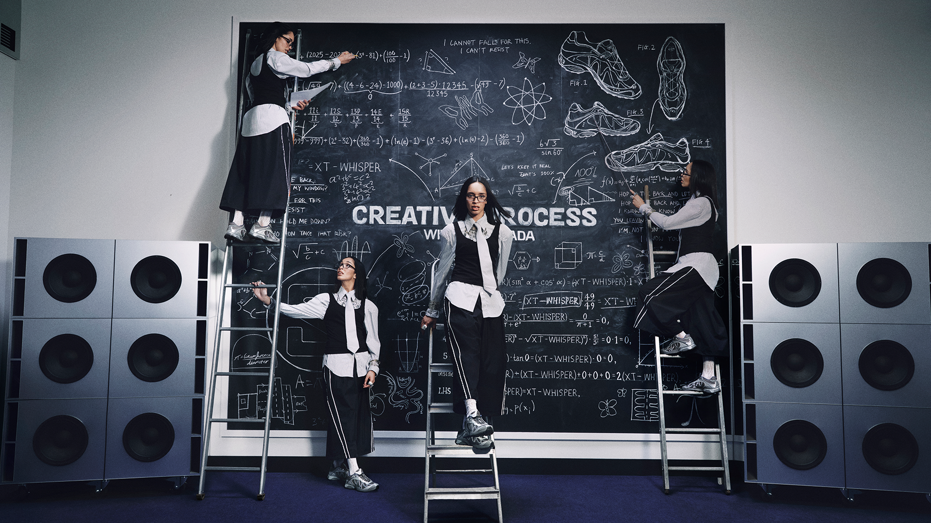
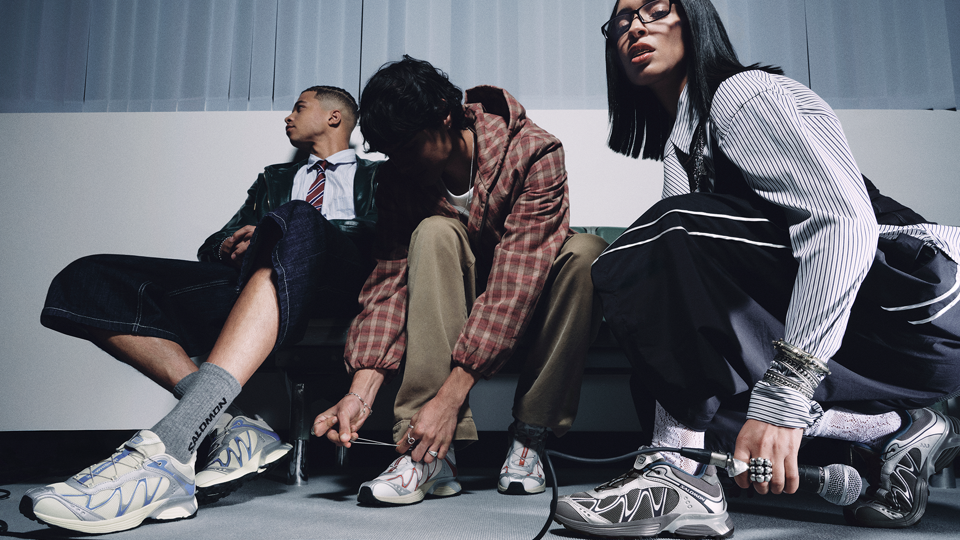
Salomon x Dina Ayada: Build the world together
When we worked with Salomon on the XT-Whisper, everything started with the artist: Dina Ayada’s creative process; her music; her movement; her story. We built talent filters around creative compatibility, genre-bending instinct, and cultural momentum to find someone whose world genuinely overlapped with the Whisper. The campaign world, Whisper University, came from her real experience of dropping out of law school to follow her dreams. A surreal campus where ideas evolve from silence to freestyle. The XT-Whisper acts as the catalyst inside that world, triggering each transformation. The shoe belongs in the story because the story was built around a real life. Strip Ayada out and the whole thing collapses: there’s no Whisper University without her in it. Neither the brand nor the artist could have made this alone. We entered Dina’s world and reimagined it together. Finding artists whose creative vision actually overlaps with what your brand stands for – rather than artists whose audience overlaps with who you want to reach – leads to better work. The future of brand-artist collaborations isn’t bigger names or louder campaigns. It’s shared worlds.
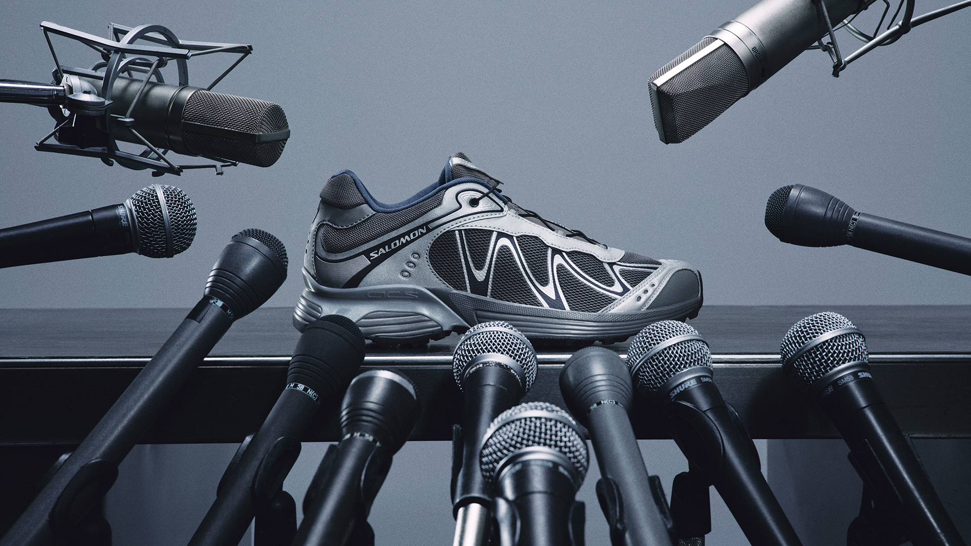
Created by MOX, the film explores creative chaos for Salomon’s XT-Whisper
To launch Salomon‘s XT-Whisper, MOX, teamed up with Belgian-Moroccan musician Dina Ayada to explore what happens when offbeat design meets untamed energy. MOX aimed to introduce Salomon‘s next breakthrough silhouette, not by going louder but by leaning into the unique design language that makes it stand apart. Briefed to build a creative world around Dina Ayada, they crafted a campaign that connects to her music and movement while staying true to Salomon‘s personality and edge.
The campaign was inspired by the butterfly effect, using Dina‘s Creative process as the jump off. Setting the piece to an original track from Dina Ayada reinforces the shoe’s raw, offbeat, and slightly absurd identity. Sitting in a surreal ‘Whisper University’, each scene becomes a chain reaction, a glitch, a gesture, a freestyle moment flips the space into something unexpected. The audience can follow Dina’s transition from a reflective waiting room to a performance-heavy lecture hall, where she presents a creative “thesis” through movement and sound. The two distinctive spaces are symbolic of Dina’s artistic evolution. Showing how creativity moves. From chaos comes rhythm. From small sparks come big echoes. At the centre of it all is the XT-Whisper, the catalyst that cracks reality open.
“The moment we spoke to Dina Ayada it was obvious this couldn’t be a traditional campaign. Her world is chaotic, instinctive and full of unexpected turns, which felt like the perfect match for the spirit of Salomon. Instead of forcing a narrative onto her, we built the whole piece around her energy, her influences and the way she creates. The result feels a bit strange, a bit electric and completely true to both Dina and the XT-Whisper.”Matt Bolton, Creative Director
Visible since the end of January, the campaign positions Salomon‘s XT-Whisper as a staple for a generation that embraces individuality and resists traditional constraints. “Working with Salomon feels natural to me. We both believe in pushing limits, trusting your voice, and showing up exactly as you are. The XT-Whisper is all about expression and that’s what my music is too. I love wearing the brand, the shoes, but I also love what it represents, a new generation that’s not afraid to be loud in its own way,” Dina said. “As someone who grew up between cultures and learned to embrace every part of my identity, that message resonates with me. My audience are my stars, and I want them to feel seen, empowered, and inspired through this collaboration.”
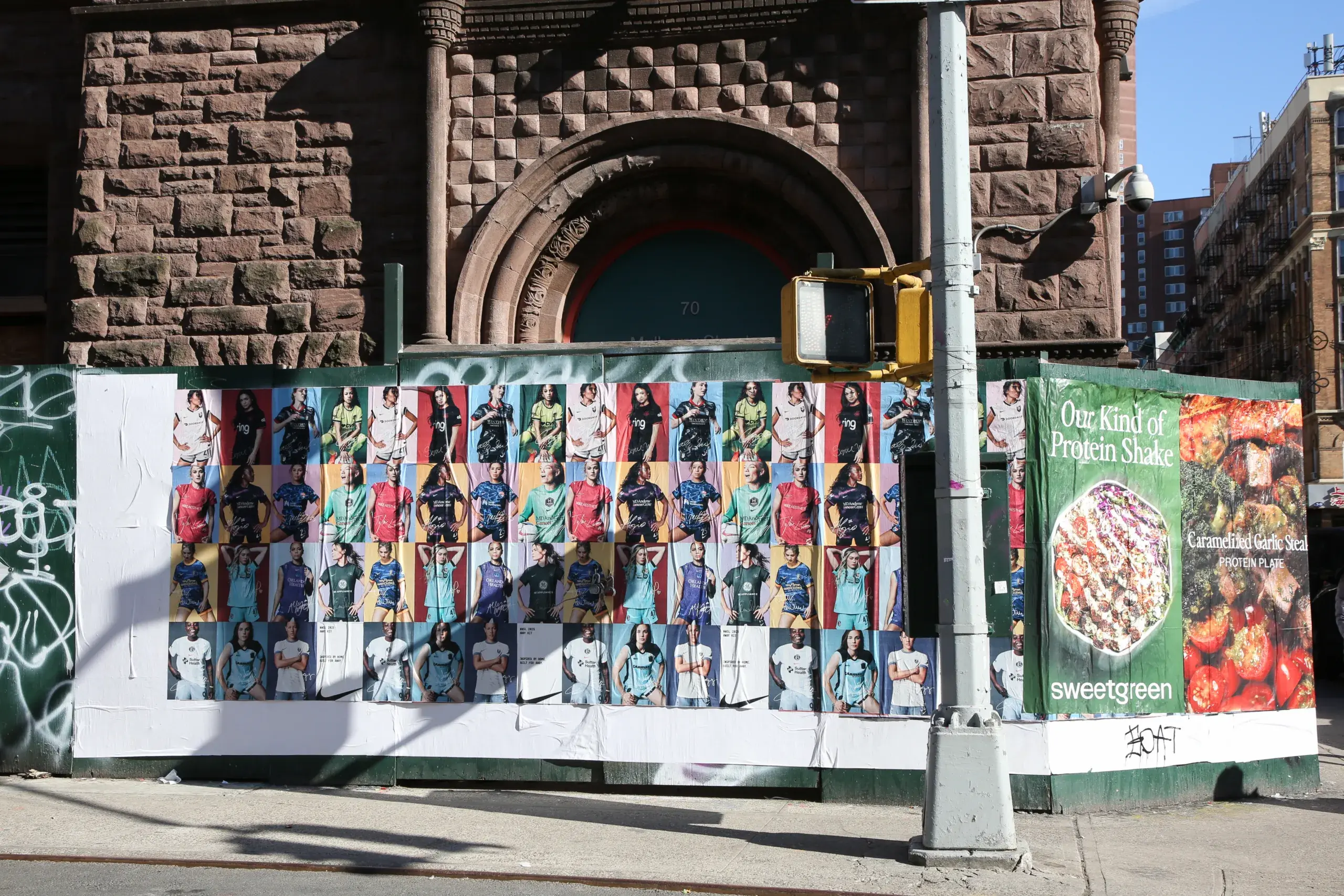
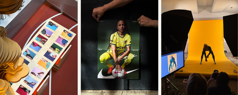
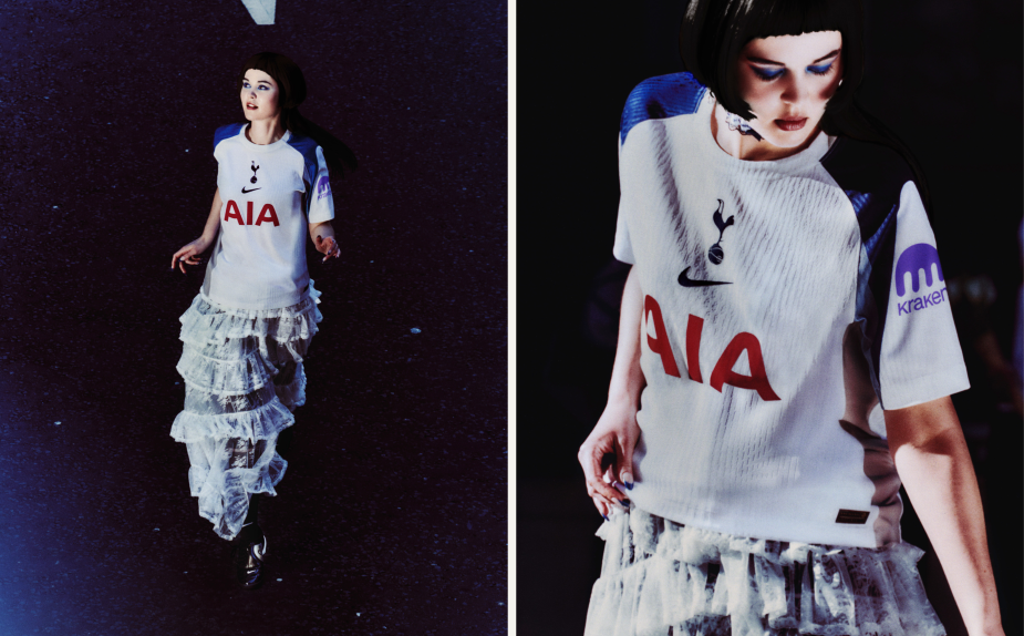
Nike and MOX have turned sportswomen into stars plastered across city streets and bedroom walls, for the debut of the US National Women’s Soccer League (NWSL) 2025 kit.
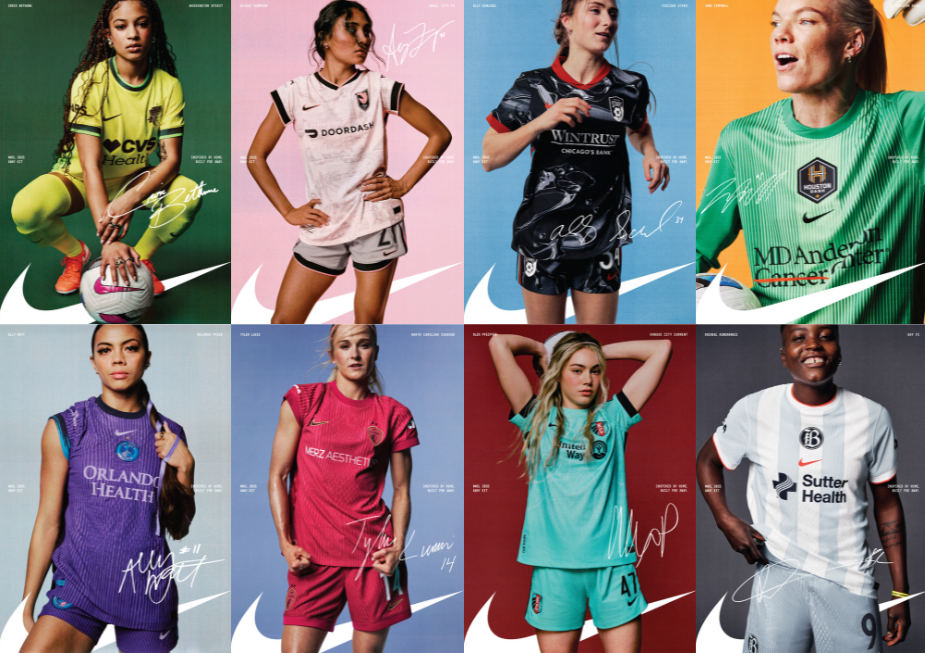
Elevating NWSL plays while heroing the new Nike kits, the digital and print campaign saw photographer Emily Lipson capture the players as star-status individuals, nostalgically recalling times when icons were found in fold-out magazine posters. But rather than framing the women’s league through a reductive, dated lens, the digital and print campaign shows off their grit and toughness through an injection of movement and expression.
Emily’s work feels timeless and textural, which made her a great fit for the creative. Her work treads the line of appearing old school and analogue, but it always has a fresh, modern spin to it which is especially present in the way she’s able to connect and capture her subjects.
Key to the campaign was MOX’s all-women team, who ensured the NWSL athletes felt comfortable and confident enough to shine on set. As each player was to be photographed in full performance wear, the team found ways to introduce variation and personality through small styling cues, from rolled-up sleeves to ribbons in hair.
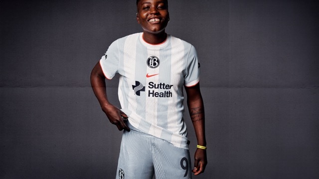
MOX wanted to work with creatives who are linked to the football world, understanding the players style and their background which led them to work with stylist Sam Herzog, co-founder of Systema Rosa – a platform aiming to bridge football and fashion.
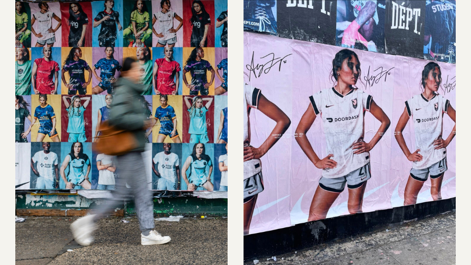
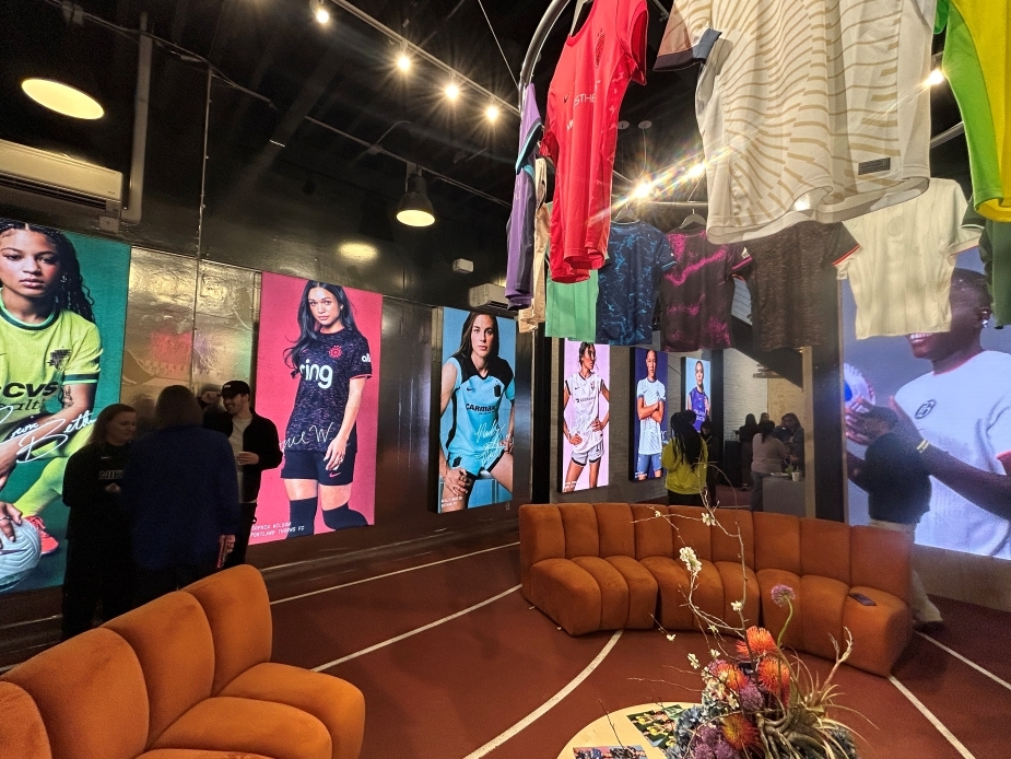
Transforming the soccer players into household names, the collection of images can be seen across Instagram, Nike live events, Mundial magazine, and in the wild around New York and LA.
Vilde Røsjø Tobiassen, senior art director at MOX and lead creative on the campaign, commented, “We really wanted to showcase the strength of these athletes. So often, athlete shoots and particularly female athlete shoots feel very repetitive and very ‘cutesy’ – they often feel a bit immature and like a college shoot. We wanted to elevate these press assets and create something that the players felt confident in and that represented their spirit on and off the pitch. We hope that we achieved this with many of the women updating their Instagram profile pictures and pinning their posts to the top of their pages.
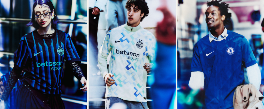
MOX partnered with photographer John Spyrou to connect the new Nike Club Kits to culture in a series of stills, harnessing the raw energy of match-day fandom.
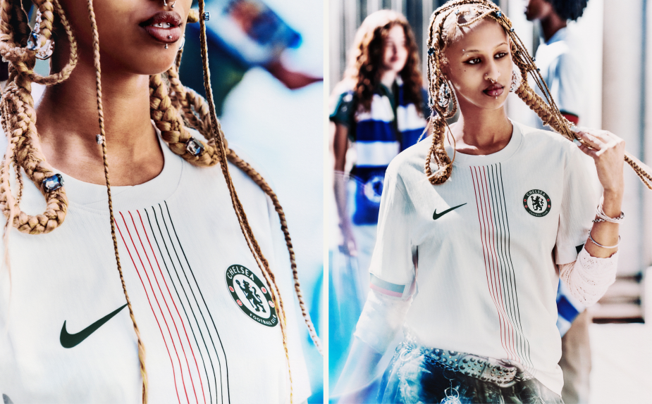
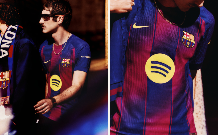
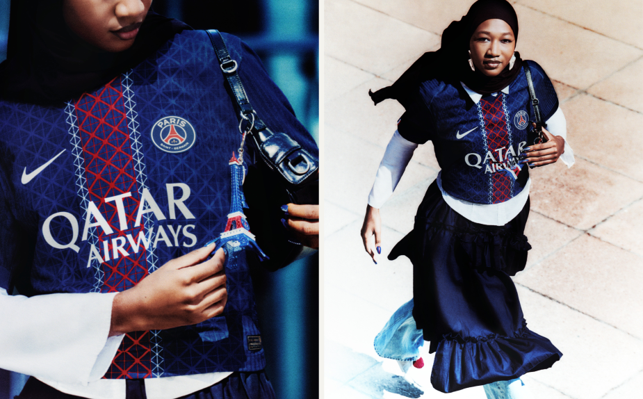
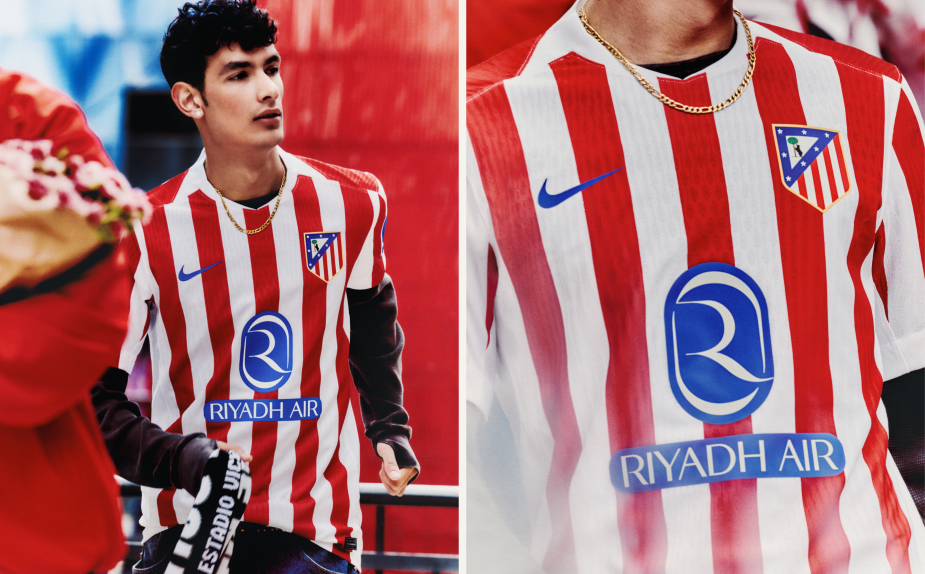
Nike teamed up with creative agency MOX to launch its 2025/2026 football club kits, with a photography campaign putting the next generation of fearless fans front and centre. With each kit grounded in the culture of its club and city, MOX matched that community connection in the visuals by selecting fans who live it every day, and layering in visual language and design cues such as background colours and textures that only real supporters would recognise. Weaving in these authentic details just for people in the know, the team rejected over-explaining in favour of a more exclusive feel. The series of 34 digital stills can now be seen across Nike’s website and socials.
“Every element of the campaign was engineered to turn fan energy into something consumers can see, feel, and wear. The setting – the busy game-day streets of each clubs’ city – lent a raw, vivid rhythm to the visuals and were brought to life through the beautiful tones of John’s colour and composition”Adam Morten, associate creative director at MOX.
For a campaign that feels as obsessed as the fans themselves, MOX enlisted photographer John Spyrou to honour the full spectrum of modern football fandom, from anticipation to ritual, quiet focus to loud celebration. John captured fans candidly in the series of stills, while styling from Charlotte Moss turned up the dial on each fan’s self-expression, allowing them to proudly wear their match day passion in a way that’s unique to them.
Photographer John Spyrou commented, “I was very honoured to be asked by MOX and Nike to shoot this very exciting project. I have been focusing more on fashion and portraiture in my work, however, because there is a frenetic and colourful energy to my imagery, it lends itself well to a brand like Nike.”
He added, “A distinct concept was provided by MOX, and it was clear that the MOX creative team were into my work and really did not want to water it down at any point during the shoot or the post-production which I was overjoyed by – a true privilege on a commercial shoot. Throughout the process the creative team worked very closely with me to make sure the relatively large collection of final images were all aesthetically cohesive but also, very importantly, hitting all the particular goals of Nike and the individual clubs. The entire process from start to finish was an absolute pleasure, exhilarating at every turn and it was such a delight to create interesting imagery with an extremely talented team.”
Jellyfish. One of Earth’s most fascinating and ethereal creatures. Inspired by their bioluminescent wonder, Swatch created its transparent, water-resistant SCUBAQUA range and, in collaboration with MOX, its accompanying campaign: ‘Jelly Effect’.
The primary films take place in a surreal world, where puddles act as portals, a glass of water spills into a sea, and fish tanks transport you to the infinite depths within. In each scenario, the protagonists plunge into the tentacled sea creatures’ aquatic realm before reemerging, drenched, in the air above. We, the viewers, are almost as immersed, drawn in by hypnotic shots, warped music, and clever blending of the natural world and man-made design.
The product films deserve equal attention, beautifully drawing out the similarities between the watches and jellyfish – who would have thought watch straps could make such convincing tentacles? – while lifestyle and CG photography offer us further glimpses at these mesmerising scenes.
It’s simultaneously fresh and on-brand, honouring Swatch’s heritage of bold, playful, conceptual creativity.
LBB’s Zara Naseer dives deeper behind the creative and special effects, in this interview with MOX, Dada Projects, and Pineapple VFX.
LBB: What was the brief from Swatch?
Catriona Brown, senior account director, MOX: Leverage the SCUBAQUA collection’s history to position Swatch as the innovative, trend-setting brand that has something for everyone and consequently increases brand relevance with gen zs. Given the heritage value this collection presents, an underlying objective was also to create interest among Swatch lovers and collectors.
LBB: How did the creative develop from there? Did you draw from any particular references?
Catriona: The SCUBAQUA watch design itself took inspiration from jellyfish, so this was our starting point for the creative. We wanted to transport the viewer to an abstract, surreal underwater world where the watch and jellyfish moved harmoniously as one.
Matt Bolton, creative director and founder, MOX: The campaign inspiration came from a few different sources. One was obviously the product. The product team had been inspired by jellyfish when concepting the watches’ design, hence its bold, bright colours and transparencies. This naturally took us to underwater worlds, also given the SCUBAQUA heritage in scuba diving… but speaking of heritage, our other main source of inspiration was around the mega brand that is Swatch. Steeped in insanely inspiring heritage, Swatch’s irreverent personality and confidence in doing things differently really inspired us to bring it into a weird and wonderful world.
LBB: The shoot sounds like a rollercoaster, with both stills and motion shot in just two days in Europe’s largest aquarium – can you tell us a bit about that experience on set?
Matt: An amazing experience, which posed some big challenges. There’s a reason we don’t know much about the underwater world!
Catriona: With tight deadlines, we had to create two campaigns concurrently, both launching in early May, which meant shooting what would normally be a three-day shoot in just two. We captured both stills and motion simultaneously, with models needing to appear dry and wet for different takes, requiring wardrobe, hair, and makeup to stay on standby.
Shooting in Bulgaria’s multi-set location allowed us to stay on track, but challenges included ensuring the models were comfortable in the deep water and acclimating them at least 24 hours before the shoot. The last few shots were crucial to get right, as it was very late, we didn’t want the models to be standing around, wet, in the cold, and we didn’t have enough time to keep getting them dry again for retakes.
We ended with mode Morgane, in the Little Shop of Jellies, doused in a bucket of water at about 11pm on a windy day. Happy to say it was a one-take wonder!
LBB: The campaign submerges viewers in its tactile, dreamlike world. Dada Projects, how did you pull off that immersive effect?
Christina Worner, founder and creative director, Dada Projects: We primarily used a wide-angle lens to bring the viewer up close to the watch, creating a strong sense of physical presence. Visually, we crafted a journey from the dark depths of the ocean up toward the light at the surface, giving the viewer a feeling of rising or progression. To enhance the ethereal quality, we gave the jellyfish a subtle glow and emphasised their translucency, highlighting intricate details on their heads and oral arms. Layering foreground and background elements, like jellyfish and drifting bubbles, combined with subtle parallax motion, helped ground the viewer’s perspective within the scene, intensifying the immersive quality.
LBB: What about the creation of the bespoke jellyfish, Pineapple VFX?
Josh Sanders, executive director and commercial director, Pineapple VFX: Blending scientific realism in digital form, with the brand’s bold, playful aesthetic was the biggest challenge. We began the process by agreeing on the species (Sea Nettle) and carefully studied the moving patterns and characteristics. Using procedural modelling and animation, the team were able to generate a huge variety in the jellyfish and then refine it with dynamic vellum simulations for added realism.
Pineapple VFX crafted jellyfish that move and react like real marine life, while glowing with Swatch’s vibrant energy. Every detail, from soft-body dynamics to bioluminescent shimmer, was designed to capture the intersection of nature and design.
LBB: Motion plays a key role in making this campaign so hypnotic – how did you make the stills just as captivating?
Amanda Wilmer, senior producer, MOX: It was important to find the right creative partner who could help tell our story. We were lucky enough to work with Shahraam Saadat who’s an incredible editorial photographer with a talent for storytelling.
LBB: For each of you, what was the most interesting challenge in bringing this campaign to life?
Matt: The most interesting challenge was bringing a unique concept to life across multiple mediums – from lifestyle films and CGI worlds to key visuals – while maintaining synergy and capturing Swatch’s irreverent personality. Integrating jellyfish into both the campaign’s visuals and lifestyle assets required continuous learning and close collaboration with our partners, Dada Projects, Pineapple VFX, and The Hand of God. The complexity of combining CGI with real-world elements in both the key visuals and post-production taught us all a great deal about the intricacies of this creative process.
Oh, and not to mention becoming experts in jellyfish. What an intricate squishy bubble of complexity.
Joshua: One of the main challenges was overseeing simultaneous workflows across three distinct commercials, all under a tight production timeline. Ensuring visual cohesion with other assets produced by Pineapple VFX, including print, required careful art direction and colour management. Integrating the CG jellyfish into live-action plates also demanded precision: aligning lighting direction, maintaining bubble continuity, and ensuring seamless compositing to ground the creatures believably in each scene.
Christina: The most interesting challenge was getting the jellyfish to behave the way we envisioned. We couldn’t rig them directly, as that would have made their motion feel too mechanical – like robots swimming through water. Instead, the most natural movement came from letting them be influenced by water currents and rising bubbles. While this approach gave us beautiful realism, it made directing their motion much more unpredictable and difficult to control.
Vilde Tobiassen, Senior Art Director at MOX, on going against the tide and embracing the feral energy of brat for winter with the ‘night b4 xcxmas’.
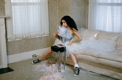
The holiday season comes with a lot of expectations. The keeping up of old traditions, of family obligations and there’s also expectations of Christmas Ads. The highly anticipated Christmas ads from the big players like John Lewis, Sainsbury’s and other high street brands fill the screens following a tried and tested and to be honest, a very expected format: the classic tugging at the heartstrings of the viewers. Animals are animated and personified, children are sad, children are happy, magical things swirl through the air, old people are lonely and suddenly the moon can talk! It’s cute, it’s emotional, but to be honest it feels dated and for a different generation. So when Converse came to us with a brief that said ‘fuck the season’, we happily obliged, better yet an opportunity to feature the icon of the year, Charli XCX. We knew that we would be steering far, far away from any traditional and typical Christmas advertising. We spent time deciphering what ‘fuck the season’ meant to us as well as what it would mean to our Gen-Z audience. Brat summer was coming to an end and we were of course highly inspired by the energy that it had brought to the world. We developed a manifesto and strategy on what it means to fuck the season. We all know that the holiday season can be pretty dead. It’s stressful, and there are all the expectations of gift-giving, dinner organising, and shopping. You have to show up looking a certain way to Christmas parties, all put together, it can be tiresome and we go through the same thing every year in an endless loop, most of us maybe wishing it was all over. Whilst it’s not all negative and Christmas can have its lovely moments, our audience wouldn’t live their lives like that during the rest of the year, accepting other people’s traditions and standards. Not very brat at all.
We wanted to explore what would happen if you let the feral energy of brat summer take over and continue into brat winter. Our aim was to create a campaign full of rebellious Christmas spirit, aimed at those who don’t want to conform. Those who embrace living unapologetically, those who embrace both being cute and disgusting, lux and trashy, fierce, being hot, dumb, ironic – all of the things at once or none at all, doing whatever they feel like doing. And who better to front this than Charli XCX herself, the queen and creator of brat.
We wanted to explore what would happen if you let the feral energy of brat summer take over and continue into brat winter.Vilde Tobiassen, Senior Art Director at MOX
With all that in mind, we developed out the overarching idea of ‘night b4 xcxmas’, moving away from the expected actions that would be happening the night before Christmas. We instead explored the rebellious actions that Charli or our audience would be doing the night before xcxmas. When it came to the art direction we wanted to honour the image and aesthetic that Charli has created for herself whilst also pushing the boundaries to create iconic imagery. Using some key filters; unhinged, provocative, fun(ny), real & holiday spirit – the campaign’s visual output embodies these guidelines.
This is the point where the creative was shared with Charli in order to get her green light on the overarching creative and strategy as well as bring in her preferences of creative partners. As a chronically online gen-z creative it was of course an honour to have the work not only seen by but approved by Charli. As we wanted the campaign to be as authentic to Charli as possible, she suggested creative partners which led us to work with photographer and director Sharna Osborne. This was the perfect fit for our campaign, her carefully crafted aesthetic of muted tones, mischievous style and slightly gritty retro, VHS world felt like the perfect visual tool to continue telling the story. Sharna honed in on the actions of the video and we worked closely to develop out the full story. We landed on Charli rebelliously shredding up old Hallmark Christmas cards, as she simply sits on a chair and stares right down the camera. A true fuck you to the holiday season, juxtaposing the retro Christmassy set behind her. We knew that this shouldn’t follow your standard Christmas ad formats, instead, we focused on a short format video accompanied by a curated selection of stills. Perfect for our audience on socials as well as being impactful enough to be shown out of home.
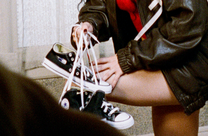
Sharna and I worked closely on developing the art direction and set design, working with the MOX production team in NYC to find a location house that had the right energy and with set designer Milena Gorum to bring it to life. The final outcome included giant pink bows, piles of presents wrapped with images of Charli, shredded Christmas cards and a sea of Converse ready to be gifted. Charli was involved throughout the whole creative process and had oversight of all changes and updates up until the shoot day as well as in post-production. We collaborated with her usual glam and styling team, and we were keen to keep her iconic curly hair and snatched eyes paired with her amazing style. The blend of Charli and Converse felt natural from the beginning, Charli even wore her own pair of chucks on the day of the shoot, which made it extra brat.Looking back on what we created, it was a super exciting, creative process. It was obviously bound to be, with such an incredible brief from Converse, allowing us to tap into our chaotic energy with the trust they gave us, and that spirit carried through into the campaign itself. It was never created to fit into the traditional Christmas ad landscape. By tapping into Charli XCX’s mischievous, daring and bratty energy and pairing that with Converse’s rebellious brand energy we aimed to create something that felt authentic and playful. Collaborating with amazing creatives who made the shoot happen in less than 2 weeks felt very brat. Hopefully, the campaign serves as a reminder that the holiday season can look like whatever you want it to look like.